After taking a trip down to Westonbirt Arboretum the other weekend to check out the autumn colours I thought it might be interesting, if only to me, to look at some of the pictures I managed to get and to explore why some images work better than others.
Managed by the Forestry Commission, Westonbirt Arboretum is located near the historic market town of Tetbury in Gloucestershire, England, and is perhaps the most important and widely known arboretum in the United Kingdom.
Planted in the heyday of Victorian plant hunting in the mid-19th century, today Westonbirt Arboretum is one of the finest tree collections in the world, carefully laid out within a beautiful Grade One listed historic landscape.
It is this variation of trees that makes the place so interesting, especially during autumn, as the transition into colour manifests itself across the species, and combined with the endless shapes and structures of the different plants, means there is always something to catch the eye.
But despite the fantastical displays of colour and the incredible variety on offer, or maybe because of it, it’s not always straightforward to get a satisfying image, it still needs thought and patience to capture something worthwhile. Just getting an image full of colour doesn’t guarantee its success, sometimes the overabundance of colour can make us overlook the other aspects that make a picture work like composition and light.
While we might try to fit in as much of the seasonal splendour before us as we can, it’s easy to forget about what we should be excluding from the frame as well. Sometimes there can be too many elements in the picture vying for attention, or too many colours for that matter. The key to a successful, natural image is to try and keep it as simple as possible, that way, as we shall see, with varying degrees of success, we will hopefully get the most impact from our photos.
I have taken two similar shots from each location and will compare why I think one is preferable to the other. Obviously I took more than two shots each time, but I discarded any that didn’t work at all and concentrated on the compositions that were most pleasing, or closest to what I envisioned when I took them. Of course all photography is subjective, so not everyone will agree with what I think works, but hopefully it will be of interest with regards to generally why a picture works, or not, over and above the merits and weaknesses of a specific image.
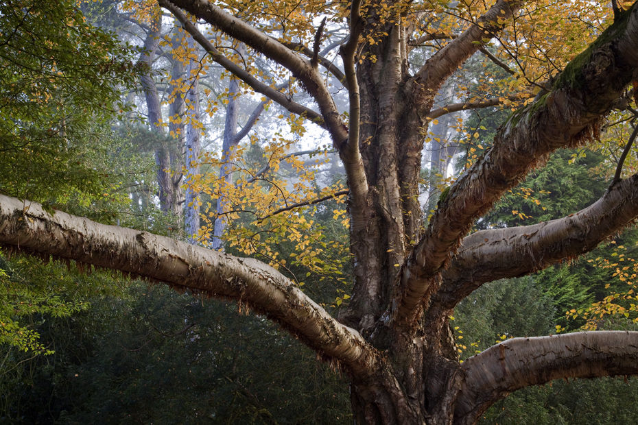
Betula Ermanii Erman’s birch

This toweringly resplendent tree is one of the arboretum’s ‘champion’ trees, which means it is the largest of its species growing in the British Isles. Westonbirt has 80 such trees but this has to be one of my favourites, with its warm, ruddy tones and huge, horizontal limbs dripping with peeling bark it really is a pleasure to stand under, and of course photograph.
By the time I visited quite a few of the leaves had fallen to the ground, meaning the canopy was looking a bit sparse, so I decided to photograph a section of the tree, rather then the entire structure, if I had there would have been a lot of dull, white sky showing through the thinning cover as it was a foggy morning, which can be fine for atmospheric shots, but not so good for skies.
I wanted to get some decent detail on the trunk, so you could really see the texture of the papery bark, and use those massive branches in a way that looked like they were reaching out of the frame and dragging you in. The first image certainly gets the texture aspect ticked off the list but as an overall image it’s not quite there.
 |
| First image, looking a bit bland |
I’ve gone in slightly too close thereby making the branch on the left almost cut that side of the frame in half, which gives the image a slightly disjointed look, plus there is very little of interest under that branch, just some scrubby bush, which has nothing to recommend it, or keep the eye interested, which is not the end of the world, but there is just too much of it to be ignored.
The biggest failing of the picture however is at the top, where the bright sky is filtering down, bleaching out the pale yellow leaves and generally giving the picture an ‘unfinished’ look. The eye is drawn to the bright part of the image and then has nowhere to go, especially as there is not enough interest in the rest of the frame to really be excited by it.
For the second shot I moved slightly to the right and zoomed out, this has the effect of bringing in more interest with the inclusion of the vibrant green tree to the left, and more crucially, it helps frame the picture, as now we have more material at the top of the image, in the form of an extra layer of leaves and another sprout of branches. This relegates the, now smaller patch, of bright sky much further behind the tree, and minimises its intrusion. It also helps the colour saturation of the leaves, as the exposure was less affected by the bright sky.
 |
| Second image, with added interest |
I had hoped the fog might have obscured those three trunks in the background a bit more, as they are slightly distracting, unfortunately it wasn’t thick enough, but at least they are better than a blank sky. So while neither of them are stunning images, the second picture works as the elements gel together much better. So despite what I said earlier about keeping it simple, this goes to show it’s how the image as a whole fits together that matters, and that I don’t necessarily know what I’m talking about.
Lime Avenue
This impressive row of lime trees is a favourite to visitors of Westonbirt and as far as photography goes, there really is only one shot that matters; looking down through the evenly spaced trunks, as these giants reach up into the sky, with their lush leaves, at this time of year, starting to turn a citrus yellow.
When this shot was taken, there was still an overriding green hue to them, as they wouldn’t fully turn for another couple of weeks, but they didn’t look any the worse for it, there is something quite imperial about their solid upright procession through the park as they dwarf everyone who wanders between them.
These two shots are obviously very similar, with one being cropped in tighter than the other, but I thought it useful to see what a simple crop could do to the dynamics of a picture. They were both taken with the camera on a tripod and from exactly the same position. So whilst the first, to my eyes, least successful of the images includes all the trees, apart from the initial set that were stood either side of me, it also brings in more of the surrounding landscape, so we can see a few of the trees that border the avenue and slightly more of the sky.
 |
| First image, with a wider perspective |
This is why the simple act of zooming in past the first set of trees you can see on the original picture, helps get rid of some of the unwanted elements and de-clutters the image. The focal length with a 24-105mm lens on a full frame camera went from 47mm on the wider image to 88mm, so not a huge difference in focal length, but enough to make a big difference with the picture. Focusing on the optimum focal point and using f/13 allowed plenty of room to obtain sharpness throughout the image.
 |
| Second image, a tighter crop of the same avenue of trees |
Pathway
These two images are immediately comparable, with a couple of slight, but important differences. I took image one because I liked the line of the path as it trailed left between the bright yellow trees in the midground. After I took the shot and was looking at it on the back of the camera, I realised that the two tree trunks on the right of the frame were overlapping each other, they had been combined into one element.
 |
| First image, with the overlapping trees |
So for image two I moved slightly to the right to bring the farthest trunk out from behind the closer one and make it recognisably a tree in its own right. So while this slightly different viewpoint did what I had intended it to do, unfortunately it had the unwelcome effect of bringing in the path at a slightly sharper angle into the picture.
 |
| Second image, the trees are separated but the path suffers |
Which goes to highlight one of the downsides to landscape photography, you can’t just pick things up and move them, well not without heavy lifting equipment and some kind of permit, all of which are hard to get hold of, trust me. But it does make you think about how objects in the frame work with each other and how, as a photographer, to make a successful image, you need to try and create a kind of harmony between them. It’s not always possible, as these two pictures demonstrate, but that should be the overall goal before the shutter is even pressed.
Acer Palmatum ‘Amoenum’
This little tree was in a stand that had, for the most part, still to go through the change, so to speak, so I was immediately drawn to it. Obviously for the bright orangey red foliage contrasting with the pale green of the grass, but also the striped, slightly gnarled limbs. I originally tried to get as much of the tree in as possible, while keeping the viewpoint fairly low so not to get too much of the bright sky in, I liked the slight downward curve of the canopy top and the overall structure of it.
 |
| First image, with most of the tree |
As you can see the second image is comprised of the bottom right portion of the first image, I have paired it down and simplified it, so we only have one of the branches coming in from the bottom left, not the whole tree and a much smaller collection of leaves, but immediately, I could see looking through the viewfinder, this was coming together much better, it seemed to fit into the frame in a very easy, natural way.
 |
| Second image, using just a portion of the tree |
I had the camera on a tripod, of course, at the lowest height and zoomed in at 105mm from a distance of a few feet, which with an f-stop of f/9 enabled the depth of field to be shallow enough to blur the background and make it less intrusive but to keep enough in there to make the closest batch of leaves sharp, only slowly losing focus through the tree as they move away. Thankfully, with a shutter speed of 0.8 sec there wasn’t any breeze to ruffle those leaves.
It was this depth of field I think that helped make the image, as it isolates those leaves, not just from the surroundings, but to a certain extent from the rest of the tree. So by simplifying as much as possible, concentrating on certain elements, rather than everything, and using the camera tools effectively it helps create a much more striking picture.
Polariser
Just a very quick one on the use of a polariser.
When shooting foliage, always use one, end of story.
 |
| First image, without a polariser - poor colour saturation thanks to reflective light |
 |
| Second image, with a polariser - much better colour saturation as the filter has cut through the glare |
Acer Palmatum
Here is another shot from looking low at the trees. The idea with the first shot was to contrast the orange of the leaves with the green of the grass, but because the light was pretty flat, and the ground, in turn, quite dark under the canopy then too bright beyond it, it didn’t really work in any way.
 |
| First image, looking quite flat and uninteresting |
 |
| Second image, with a bit of form, movement and light |
The light has also helped bring out the different hues in the leaves, in the first, flat shot, they are more or less a uniform orange, in the second, the yellows and pinks and reds gleam in an effervescent cocktail of colour.
In the second shot the dark ground works well because it contrasts so nicely with the bright leaves and really makes them stand out. I was worried that the clump of grass in the bottom left corner might be distracting but I actually don’t mind it. It seems to add a full stop, albeit a vaguely unkempt one, to the gushing tumble of foliage heading towards it and keeps the eye in the frame.
Acer Palmatum ‘Ornatum’
This final shot is of one of the more attractive Acers at Westonbirt. The first image is of the whole tree and is quite nice, as the tree is a striking shape and colour but it doesn’t really do much, it’s just there sat in the middle of the frame being what it is.
 |
| First image, the complete tree as it is |
For the second photo I moved in closer and made use of the sunlight that was bathing the canopy. By spot metering one of the leaves, thereby exposing for it correctly, and knowing that this would mean the darker section under the canopy would be underexposed, I used the natural light to make those leaves shine out from the tree behind. Couple this with a shallow depth of field of f/5.6 which made the tree trunk and the leaves in the background soft, whilst the foreground leaves sharp, increased this sense of three dimensionality.
 |
| Second image, with a bit of care something interesting appeared |
As we have seen before, if you can get the right elements working together in the frame; light and shade, form and structure, colour and contrast, along with making the most of the tools that the camera has to offer, then an image can pop, it can be more than a 2 dimensional representation of what was there, it can say something about what you saw, or make you look at it in a new way.
And surely that is the ultimate goal for any landscape photograph.
Hi - this is very interesting. Lovely to read the commentary, which helps me to identify the reasons why one picture is 'better' than another. It will be useful to me in my own photograpy. I have a gut instinct, but not so good at the words/rationalisations. Great.
ReplyDeleteThanks very much for the comment, i'm glad it was of use and i wish all the best with your photography.
ReplyDelete